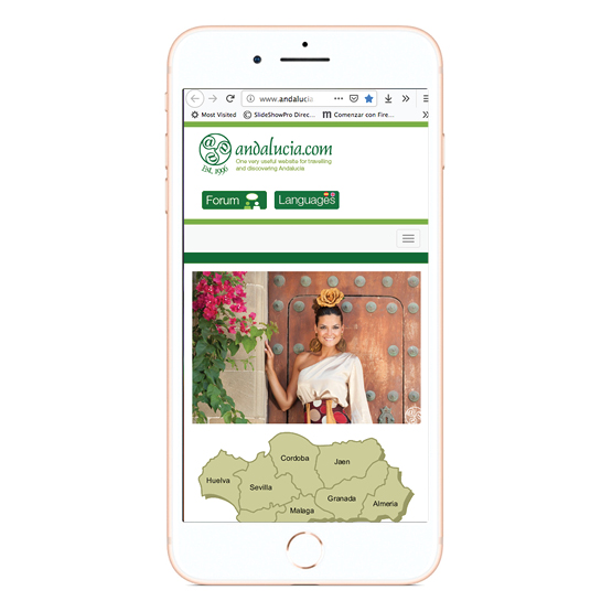
Mobile devices are rapidly becoming the dominant way of accessing websites, with 20% of Spanish now using this method to surf the internet. It is increasingly important to make this content accessible to the 4.6 billon mobile phone users globally. This area is growing at an accelerated rate, thanks to improved handsets and smart phones, such as the iphone and Blackberry with Wifi and G3 connectivity.
Now that most mobile carriers (phone companies) have dropped restrictive, so-called ‘walled garden' practices, allowing open web surfing by customers whose mobiles are contracted to their services, the main problem encountered by content providers and their website developers is the wide variety of screen sizes on which content has to be displayed.
The processing power also varies between older mobile phones and the more recent smart phones, and this aspect also has to be taken into account.
Here are four different strategies for the website owner to consider in extending reach to mobile phones.
- Do nothing
"Fingers crossed and hope the website works OK." As smart phones and screen resolution improve, websites designed for the desktop environment are actually improving too.Some smart phones are surprisingly apt at repurposing sites rapidly to fit the smaller widths of mobile phones. With devices such as the iPhone, whose browsers are capable of content-zooming (also referred to as "adaptive zooming" or "mini-map navigation"), many fully-featured websites can be viewed much the same as from a desktop PC. Andalucia.com, with its central body of text, can even be read clearly on an iPhone held in landscape position without any need to zoom, or even having to scroll from side to side.
- Reduce Images and Styling
Most modern mobile devices today recognize the HTML language of desktop-designed websites. Presentation-styling graphics and photo images are reduced on the fly either by reduction in file size or elimination, leaving raw, minimally-styled content.One popular ready-made user resource to perform or demonstrate this rendering method is the ‘Mowser' website. The mobile user simply enters the desired website address in the box at mowser.com, which then serves up content that has been compressed for mobile. Try it on a desktop or mobile here http://mowser.com/web/andalucia.com
- Handheld style sheets
This method is the poster child of the mobile-friendly web. It requires the developer to create one (or more) additional CSS (cascading style sheets), written especially for mobile devices with properties which reposition or remove unnecessary styling or content, such as background images and secondary navigation.When mobile users are presented with the same web address, the mobile device is detected, the alternatives CSS provided, and the mobile-friendly version appears on the screen.
But it's not all rosy. It is more aesthetic than contextual in delivery, and large graphics may be downloaded and not displayed. In its simplest form, the mobile detection (by CSS media='handheld') can be hit or miss on some phones - some would say more miss than hit. One mobile-detection solution works by detecting screen size rather than device and then giving the user the option to be redirected to the mobile version.
Other robust solutions detect the actual mobile browser and device from an online database (which must be continually updated) and serve the specific CSS for that website content and that device. See washingtonpost.com by Mobiletech.
- Create Mobile-optimised Content
This is the custom mobile website. This method addresses how the content is accessed and what it looks like. Content that is not feasible or necessary for the mobile user is either removed or adapted. New features that make use of mobile device capabilities, such as location awareness, can be included. The downside is the additional ongoing work to maintain two websites. See kayak.com/mobyA very neat micro-site version of the custom mobile website is the gomobi.com concept. See icann.mobi
It has to be said that this method has issues with the ‘One web' notion of those involved in the W3C's Mobile initiative (see www.w3.org/mobile) "One web means making, as far as reasonable, the same information and services available to users irrespective of the device they are using."
Which method is best to take your website mobile? Like everything, each method has distinct advantages and disadvantages. The mobile environment is changing all the time, and mobile phone capability is improving so fast that timescales are essential. Does one adopt a ‘medium-term ' (I can't use the phrase long-term) solution, or a short-term test followed by a planned upgrade?
Where to put you mobile content?
Currently the most popular locations are mobile.yourdomain.com and yourdomain.mobi, or both. The .mobi top-level domain was created in 2006 specifically for mobile websites and backed by the major mobile phone companies.
